
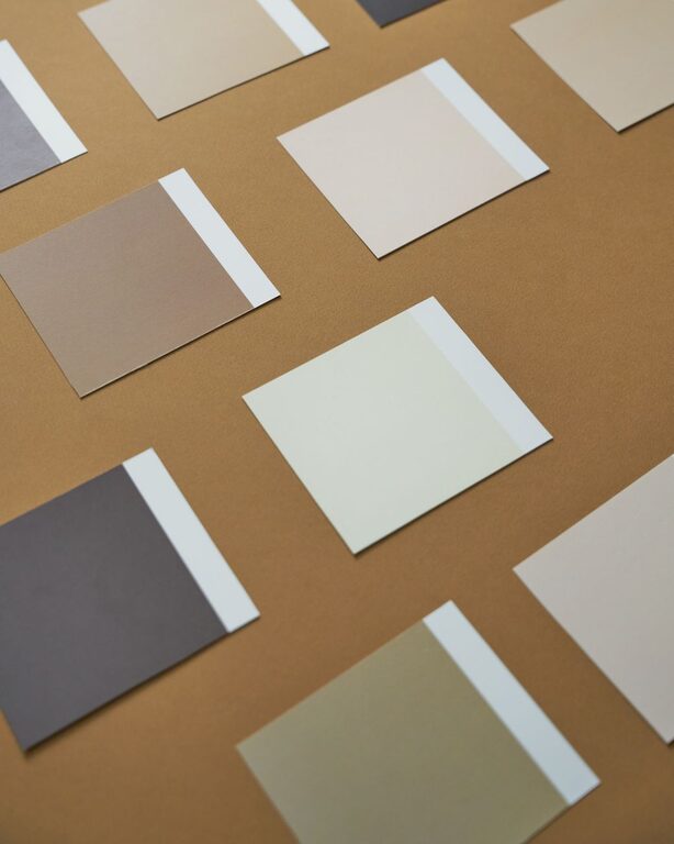
Choosing calm colors for your home can make each room feel more comfortable, balanced, and inviting. Soft colors may help a space feel open and peaceful, while gentle deeper shades can add warmth and coziness without becoming overwhelming.
The best calming color scheme depends on more than personal taste. Natural light, room size, furniture, flooring, and the way you use a space all affect how a color looks and feels. With a few simple guidelines, you can create a home that feels restful while still reflecting your style.
Start With the Feeling You Want
Before choosing paint or accessories, think about the mood you want to create. Different color families can support different impressions:
– Soft blues often feel fresh, quiet, and airy.
– Muted greens can bring to mind nature and balance.
– Warm whites create a clean look without feeling too stark.
– Beige, taupe, and sand tones add gentle warmth.
– Pale grays can feel modern, simple, and peaceful.
– Dusty pinks and soft terracotta shades add warmth and personality.
– Deep muted colors can make a room feel cozy and grounded.
You do not need to use only one color family throughout your home. Instead, choose colors that work well together and support the purpose of each room.
Consider the Room’s Natural Light
Light has a major effect on how colors appear. A shade that looks soft and warm in one room may look cool or dark in another.
Rooms with abundant sunlight can usually handle cooler colors, such as pale blue, soft green, or light gray. Bright light may make these shades appear even more vivid, so muted versions are often a good choice.
Rooms with little natural light may benefit from warmer tones, including creamy white, light beige, warm gray, or pale tan. These shades can help the room feel welcoming rather than cold.
Pay attention to the direction of the windows as well. North-facing rooms often receive cooler, less direct light, while south-facing rooms tend to receive warmer and brighter light. East- and west-facing rooms can change noticeably throughout the day.
To test a color, place a sample on several walls and view it in the morning, afternoon, and evening. This simple step can prevent surprises after painting.
Use Undertones to Create Balance
Every color has an undertone, even neutral shades. White may have blue, yellow, pink, or gray undertones. Beige may lean toward yellow, pink, or green. These subtle differences can affect whether colors look coordinated or mismatched.
A calm color palette usually feels more cohesive when the undertones work together. For example:
– Pair a warm white with beige, cream, and soft brown.
– Combine a blue-gray with cool white and muted blue.
– Use a green-gray with natural wood and soft beige.
– Match a pink-toned neutral with dusty rose, cream, or warm gray.
When comparing paint samples, hold them next to your flooring, trim, cabinets, and larger furniture pieces. A color that looks appealing by itself may not work well beside existing materials.
Choose a Simple Color Palette
A limited palette often creates a more peaceful feeling. Instead of selecting a different strong color for every room, choose a few related shades and repeat them throughout the home.
A useful approach is the 60-30-10 rule:
– Use one main color for about 60 percent of the room, such as walls or a large rug.
– Use a secondary color for about 30 percent, such as furniture, curtains, or bedding.
– Add an accent color for about 10 percent through artwork, pillows, lamps, or small accessories.
The proportions do not need to be exact. The goal is to create visual balance. If your walls are a soft neutral, you might add muted green furniture and small touches of natural brown. If your walls are pale blue, warm wood and cream textiles can keep the room from feeling too cool.
Think Beyond Paint
Calm colors do not have to come only from painted walls. Textiles, furniture, rugs, artwork, and natural materials all contribute to the overall color scheme.
Consider adding:
– Linen curtains in cream or light beige
– Wool or cotton rugs in soft neutral shades
– Ceramic pieces in muted colors
– Wood furniture with natural finishes
– Green plants for a gentle connection to nature
– Bedding in layered whites, grays, or dusty blues
– Woven baskets and textured accessories
Using color in several materials creates depth without making the room feel busy. A single shade can look flat if every surface has the same smooth finish, while varied textures make a calm palette feel more interesting.
Use Color to Support Each Room’s Purpose
Different rooms may benefit from different types of calm colors.
Living Room
A living room often works well with warm neutrals, soft greens, or muted blue-gray. These colors can create a relaxed setting while allowing furniture and artwork to stand out.
If you enjoy a neutral room, add interest through texture. Combine a beige sofa with woven baskets, a patterned rug, wood accents, and soft cream pillows.
Bedroom
Bedrooms are ideal for quiet, low-contrast colors. Pale blue, gentle green, warm white, and soft lavender can create a restful atmosphere. Avoid using too many highly contrasting colors if you want the room to feel serene.
Layering similar shades in bedding, curtains, and rugs can make the space feel comfortable and thoughtfully designed.
Kitchen
Kitchens can feel calm with warm whites, light gray, soft sage, or muted blue. These colors pair well with wood, stone, brushed metal, and simple tile.
If you have colorful cabinets or countertops, choose a quieter wall color that supports the existing features instead of competing with them.
Bathroom
Bathrooms often suit clean, gentle shades such as pale blue, sea glass green, warm white, and light gray. Natural textures, such as wood-look accessories or woven storage, can soften a room with hard surfaces.
Be Careful With Very Bright Colors
Bright colors are not automatically unsuitable, but large areas of intense color can feel energetic rather than calm. If you love a vivid shade, use it in smaller ways through artwork, towels, a vase, or an accent chair.
You can also choose a muted version of the same color. For example, replace bright yellow with soft ochre, vivid green with sage, or strong blue with dusty blue. These softened shades add personality while keeping the overall atmosphere relaxed.
Look at Colors Next to Fixed Features
Before committing to a color, check how it looks with the features that will remain in the room. These may include:
– Flooring
– Countertops
– Cabinets
– Tile
– Window frames
– Doors
– Large furniture
– Metal finishes
Take photos of the room and compare samples in natural and artificial light. If possible, paint a large sample board rather than relying on a small card. Large samples make it easier to see the color’s true character and how it interacts with the rest of the room.
Keep the Whole Home in Mind
A calm home usually feels connected from room to room. The colors do not need to match exactly, but they should share a similar level of softness or warmth.
For example, you might use warm white in hallways, pale sage in the living room, sandy beige in the kitchen, and muted blue in the bedroom. Repeating one or two colors through accessories can help the spaces feel related.
Most importantly, choose colors that make you feel comfortable. Trends can offer inspiration, but your home should support your daily routines and personal preferences. Start with small samples, observe how the colors change throughout the day, and build a palette that feels natural to you. With thoughtful choices, calm colors can make your home feel more balanced, welcoming, and easy to enjoy.